Kiko Display
Kiko Display is an in-progress reverse-contrast display typeface dedicated to my rooster, who brings me much joy. From packaging to signage, I picture this typeface to have a wide-range of use for different types of creatives.
Infuse work with personality and interests while learning the practical skills needed to navigate the constraints of designing a system of letters. Completed during a 10-week duration.
Infuse work with personality and interests while learning the practical skills needed to navigate the constraints of designing a system of letters. Completed during a 10-week duration.
2021
Tags: Illustration, Type Design

Process
View full process ︎︎︎
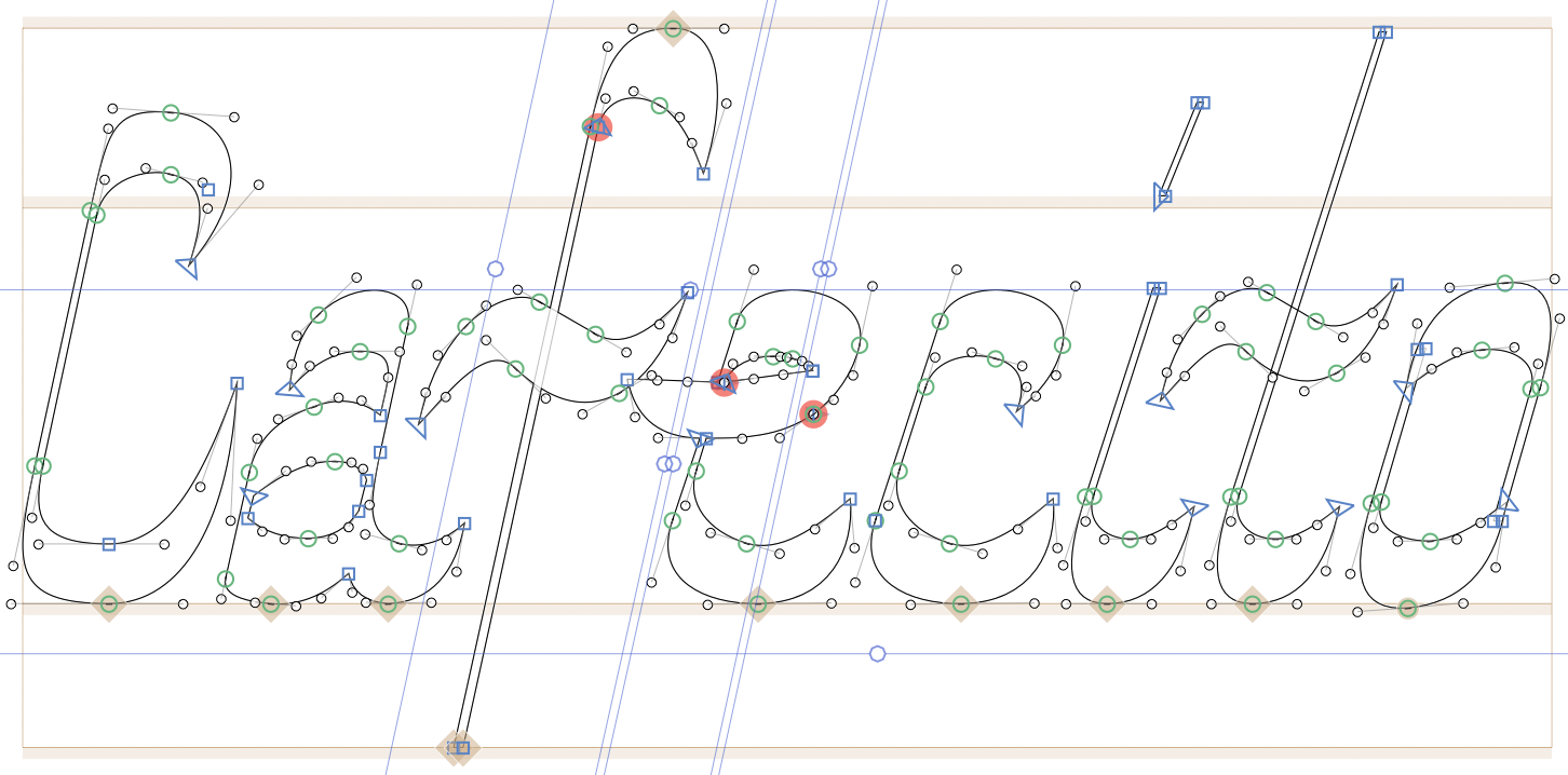
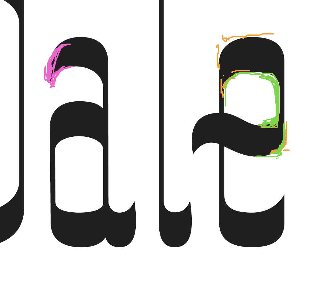
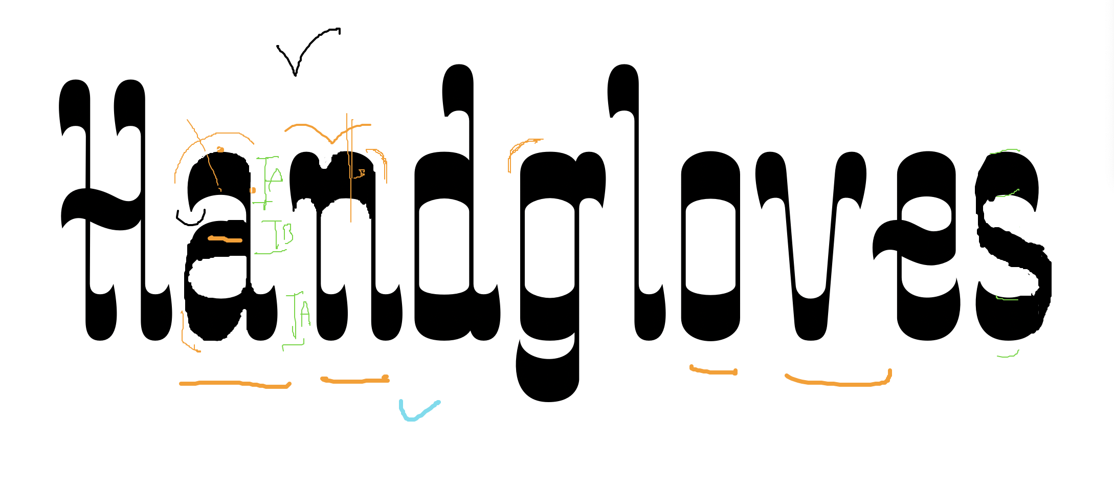
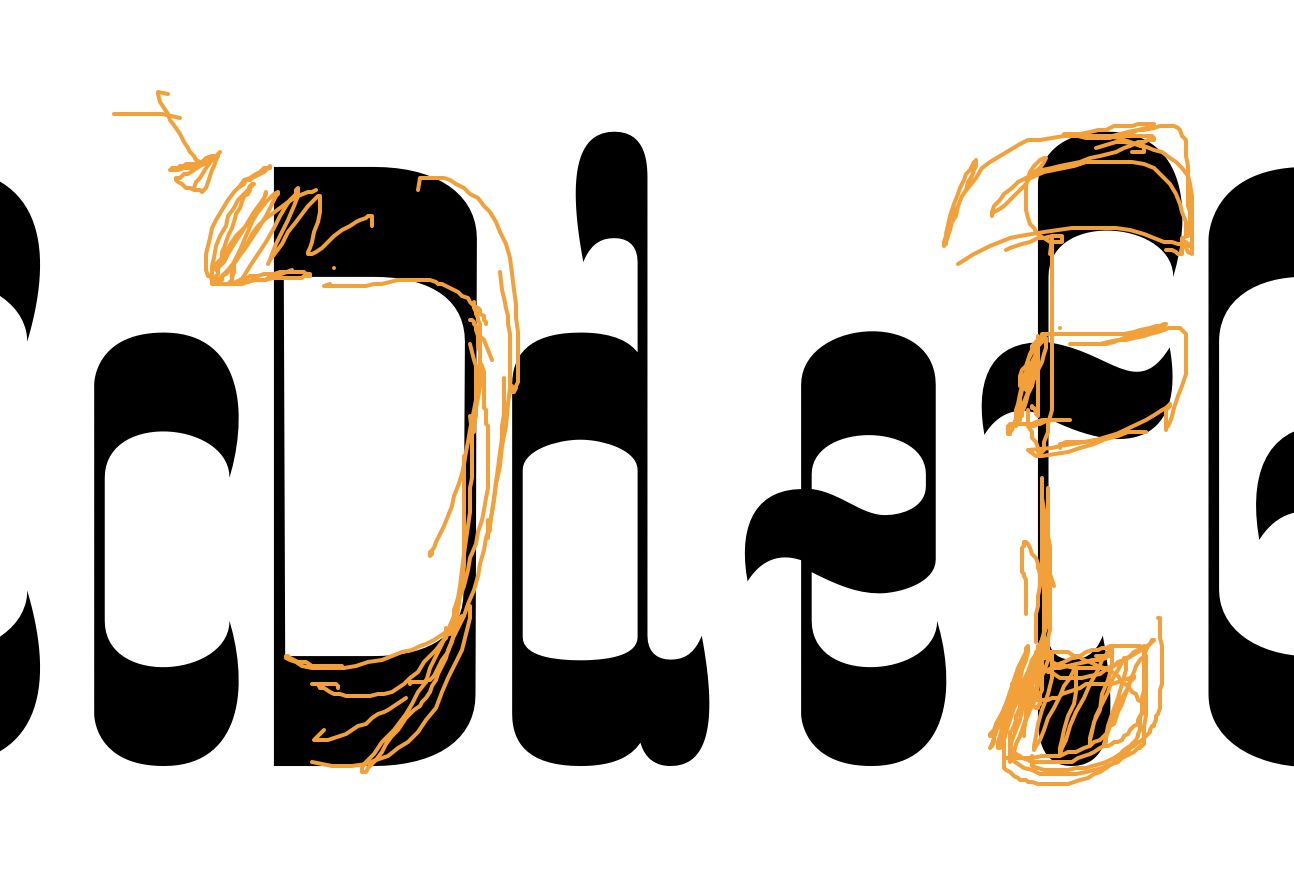
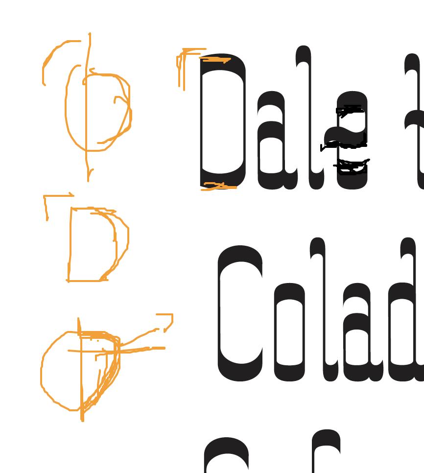
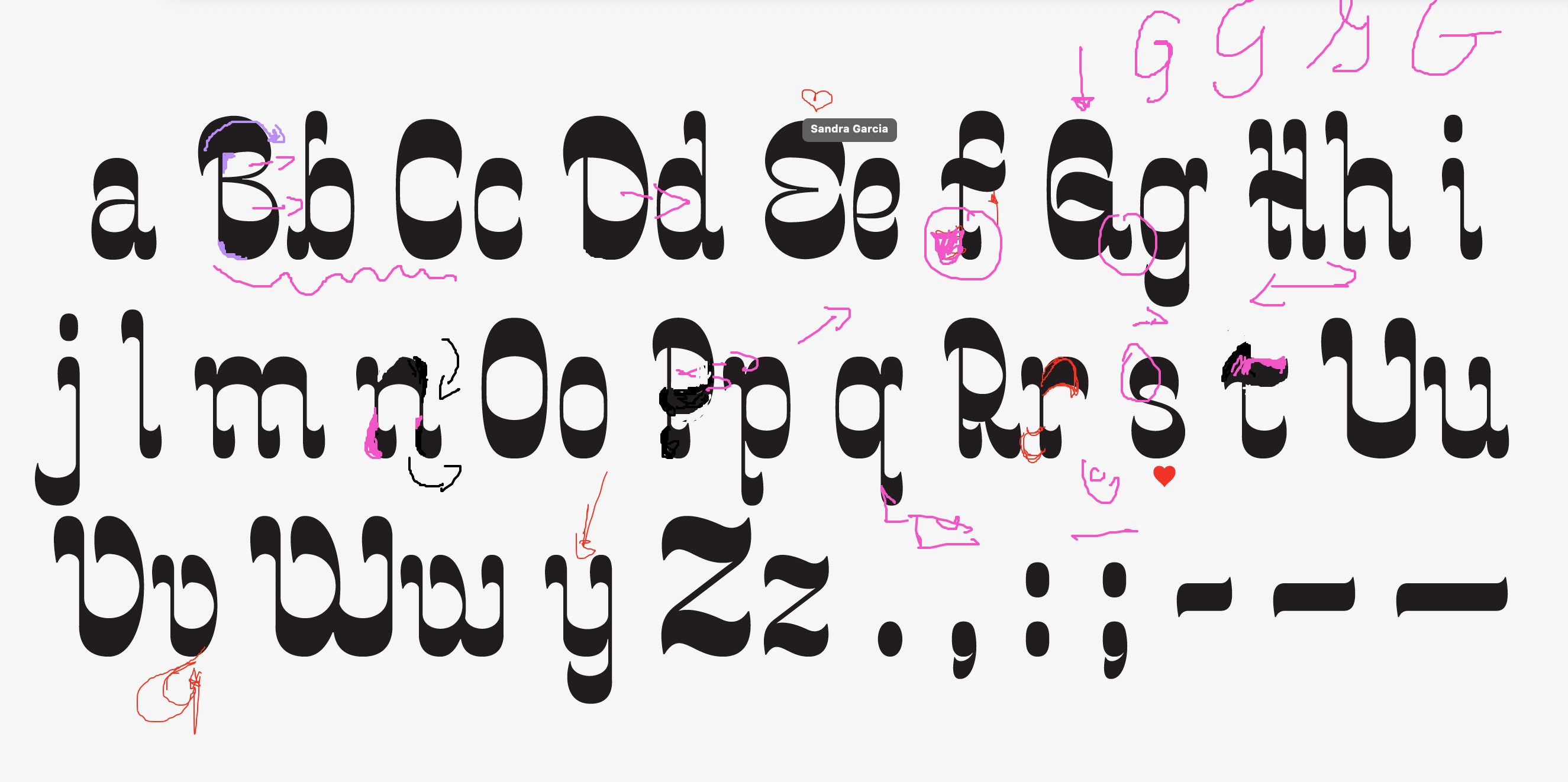
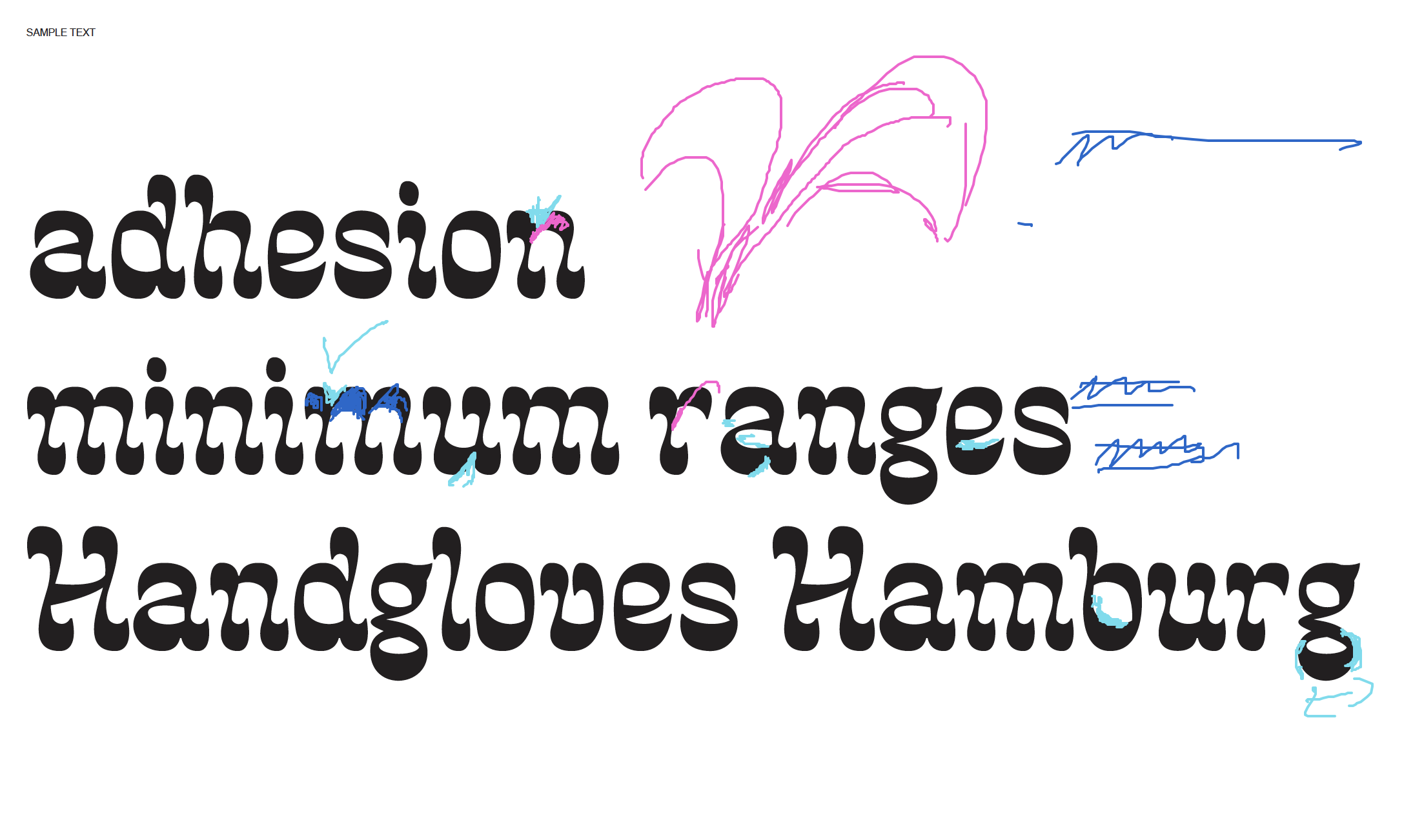
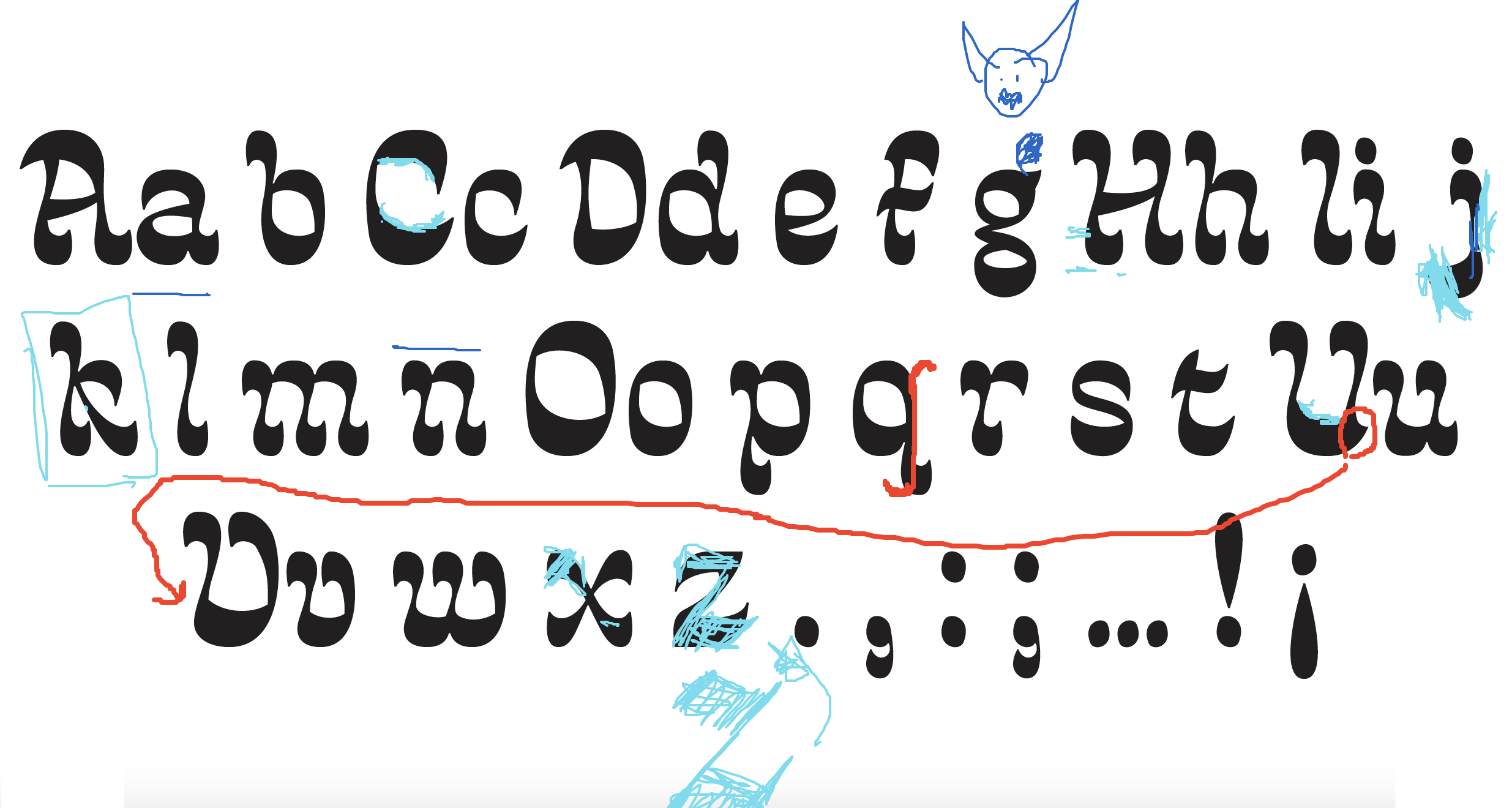
Influenced by the translation mode of drawing, I crafted each letterform with intent—voluptuous shapes, curvilinear stems, and exaggerated serifs reflect the rooster’s physical traits. The reverse contrast adds eccentricity and bold visual impact.


Final Deliverables
View on class exhibit website ︎︎︎


Typeface in Use
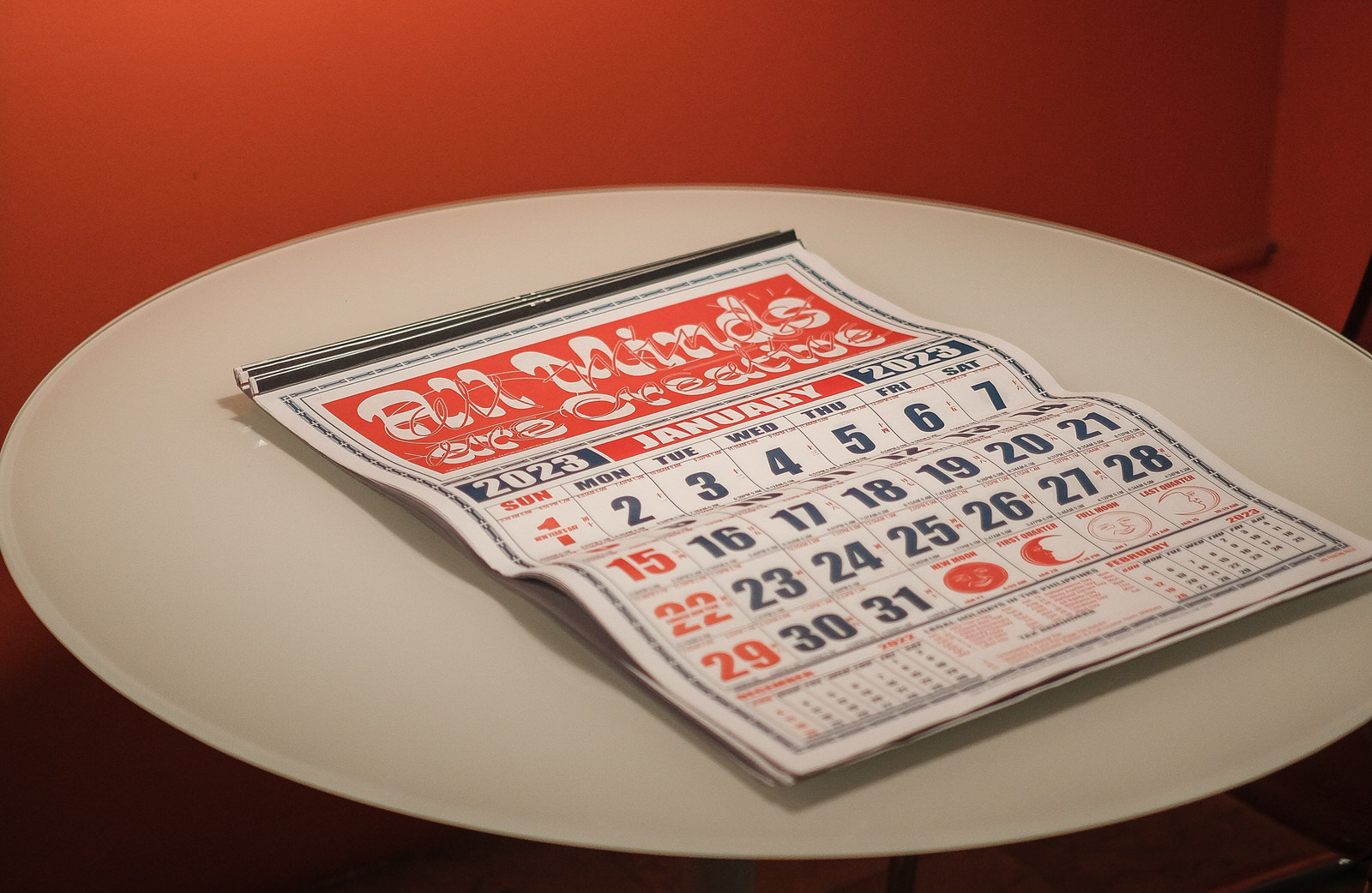
“All Minds are Creative” PURVEYR x Type63 2023 Calendar
Contributed typographic composition for January featuring Kiko Display. Read the full article here.
Contributed typographic composition for January featuring Kiko Display. Read the full article here.
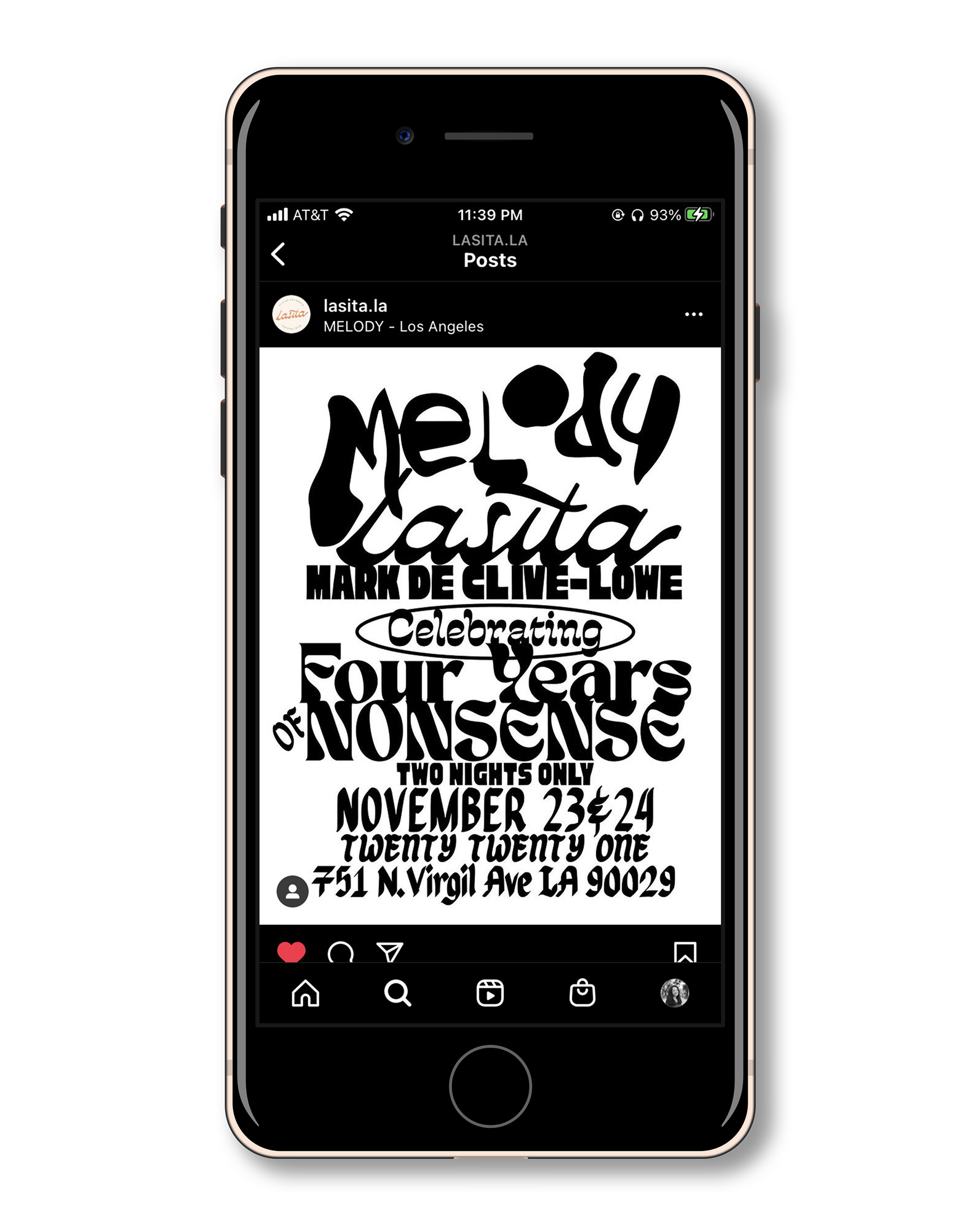
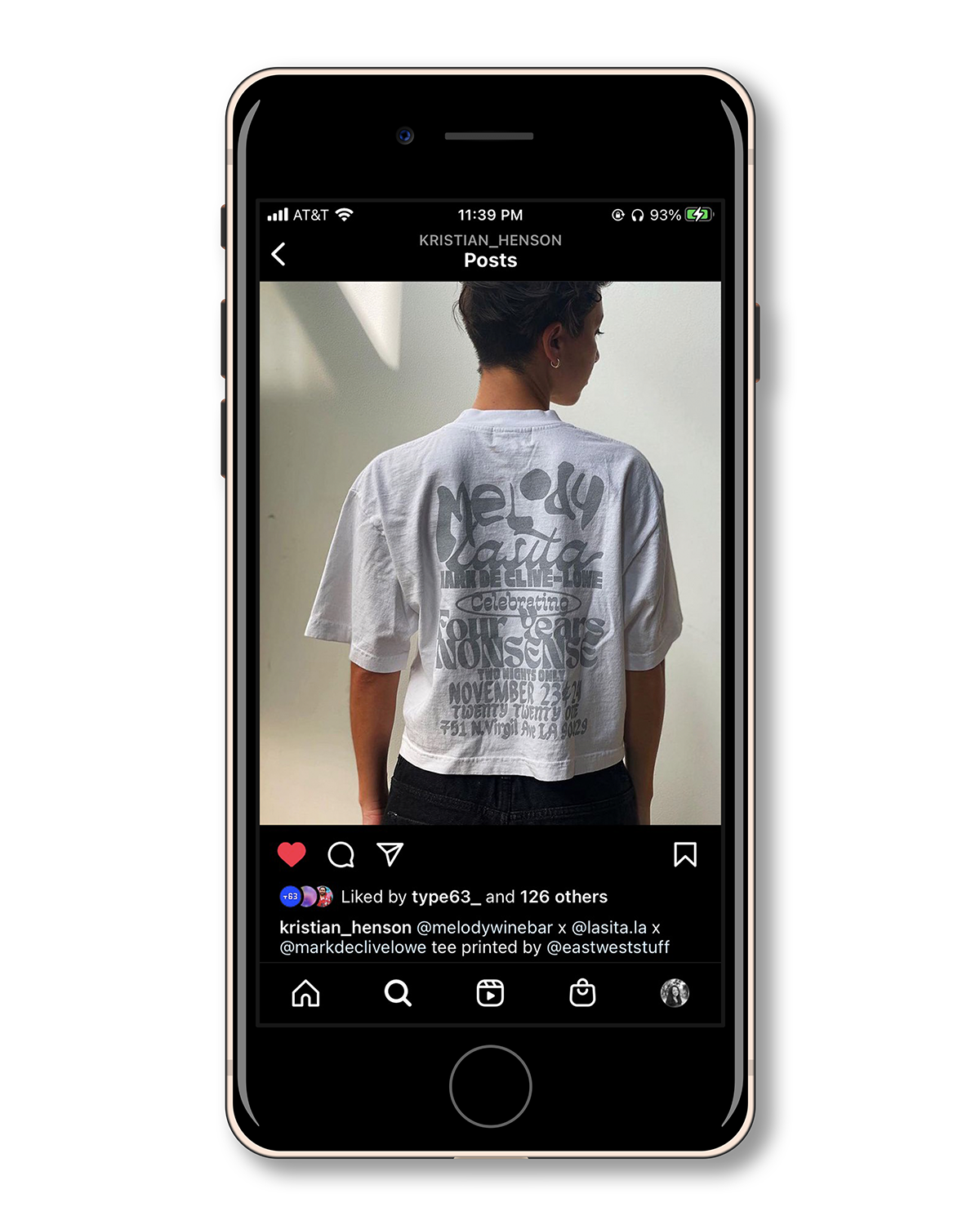
Event Poster — Melody Wine Bar x Lasita LA x Mark de Clive-Lowe
Kiko Display made a small appearance in a poster designed by Kristian Henson, featuring typefaces by Filipino, Fil-Diaspora, and Global South type designers.
Kiko Display made a small appearance in a poster designed by Kristian Henson, featuring typefaces by Filipino, Fil-Diaspora, and Global South type designers.

Journées du Matrimoine Campaign — Architecture qui dégenre
Kiko Display featured in a social media graphic designed by Esther Le Roy and Sarah Cleeremans for the Matrimony Days campaign in Brussels, Belgium.
Kiko Display featured in a social media graphic designed by Esther Le Roy and Sarah Cleeremans for the Matrimony Days campaign in Brussels, Belgium.