Ampersand
Ampersand is a virtual design conference concept created for multidisciplinary creatives. The identity explores how unexpected discoveries emerge when design intersects with other fields, centering texture, energy, and connection. The result is a bold and elastic brand language that bridges type and interface.
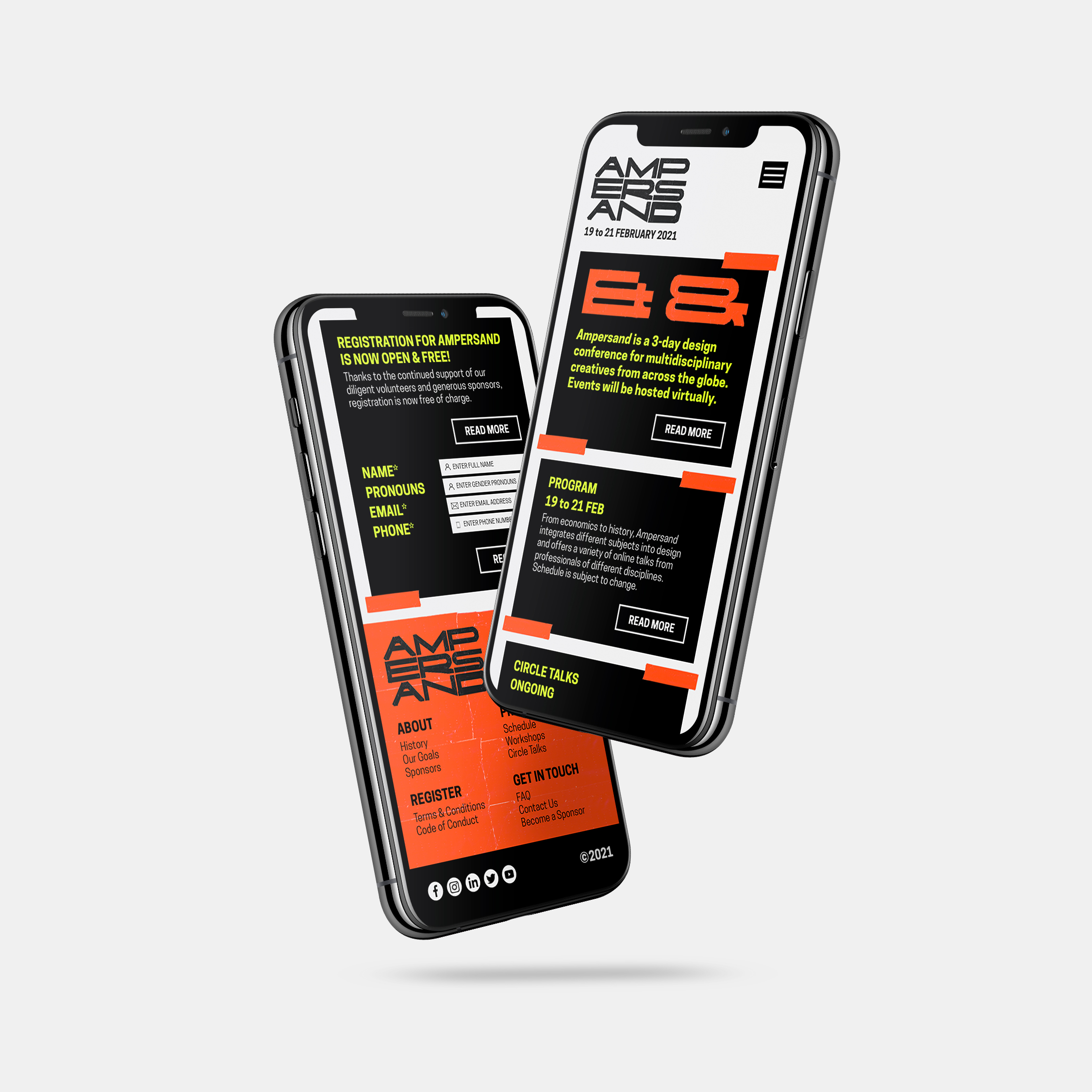
Scope included planning, visual identity development, copywriting, and prototyping a responsive website tailored for global speakers and diverse audiences.
Scope included planning, visual identity development, copywriting, and prototyping a responsive website tailored for global speakers and diverse audiences.
2021
The ampersand began as a ligature of the Latin letters e and t in et, meaning “and.” Once the 27th quasi-letter of the alphabet, it was called “and per se and,” which over time evolved into the word ampersand.
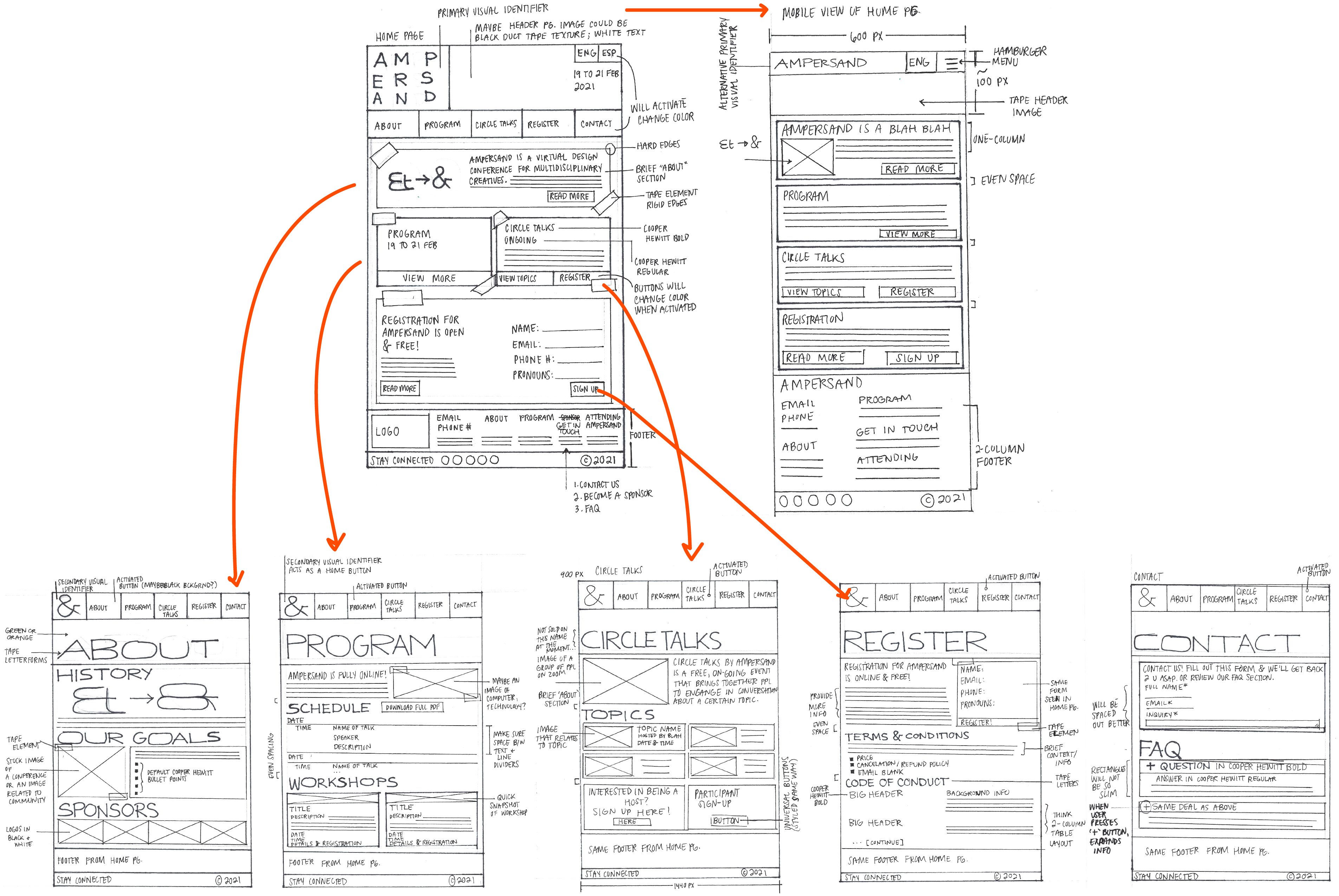
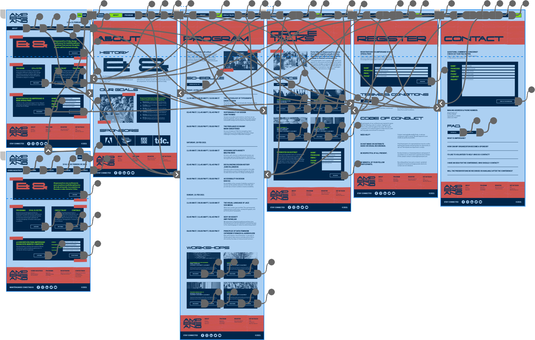
Approach
Initial exploration began with low- and high-fidelity sketches to define structure and tone. The process focused on capturing a visual sense of adhesion, layering, and momentum—qualities that reflect the conference’s multidisciplinary theme. Concepts were refined into a modular logotype suite and supporting UI components.
Outcome
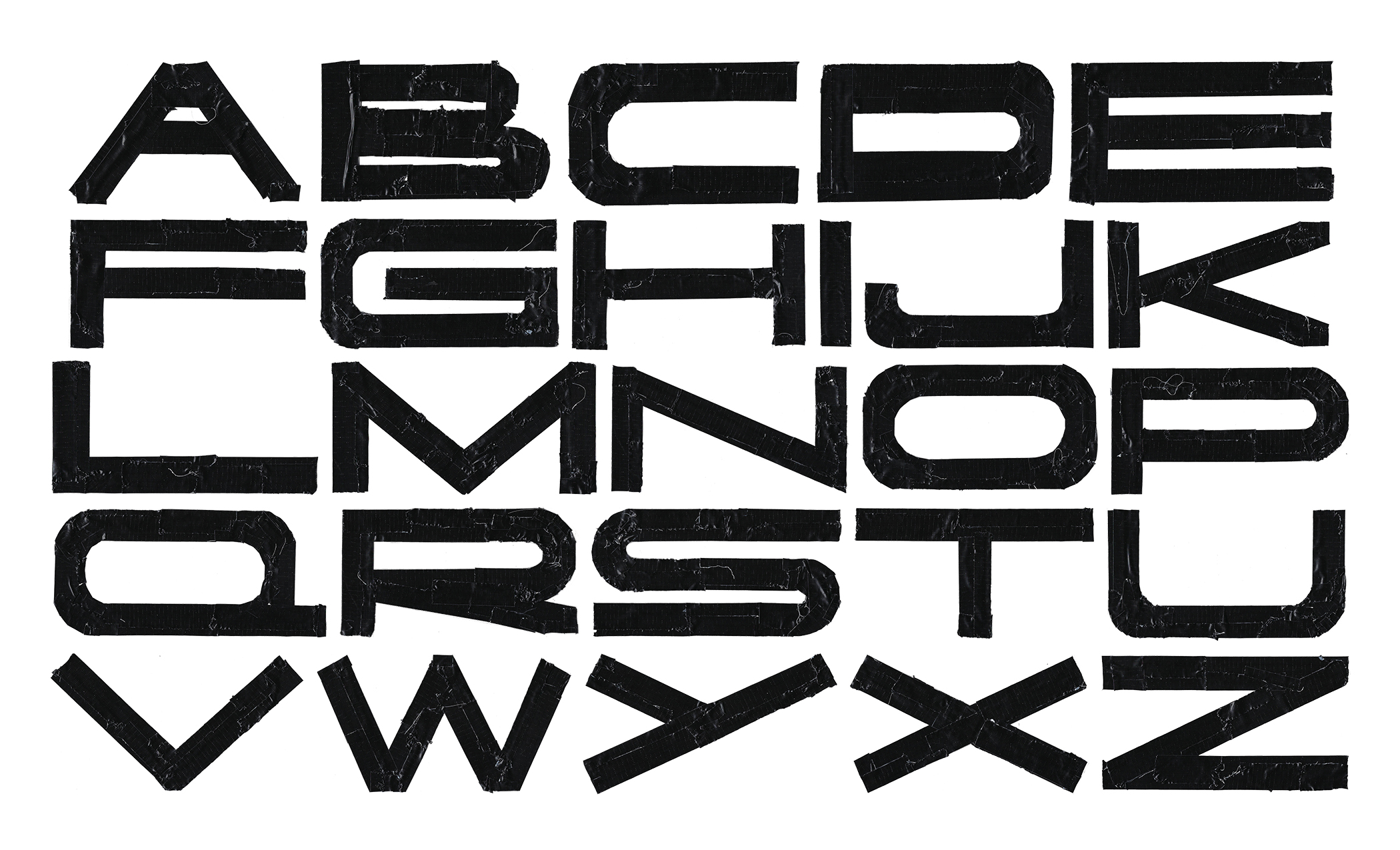
Deliverables included a flexible logotype system, extended letterforms built from duct tape to represent adhesion and intersection, and a fully designed desktop and mobile website prototype.
View prototype ︎︎︎