MORE SOLUTIONS!
MORE SOLUTIONS! is a Toronto-based small business specializing in LED lighting and electrical design. The brand identity needed to strike a balance between professional utility and bold presence, helping the company stand out in a competitive B2B space while communicating its energy-forward focus.
Scope included logotype refinement and finalization, incorporating client feedback and technical adjustments for use in business collateral and branding.
Scope included logotype refinement and finalization, incorporating client feedback and technical adjustments for use in business collateral and branding.
2020
Tags: Illustration, Typography
Approach
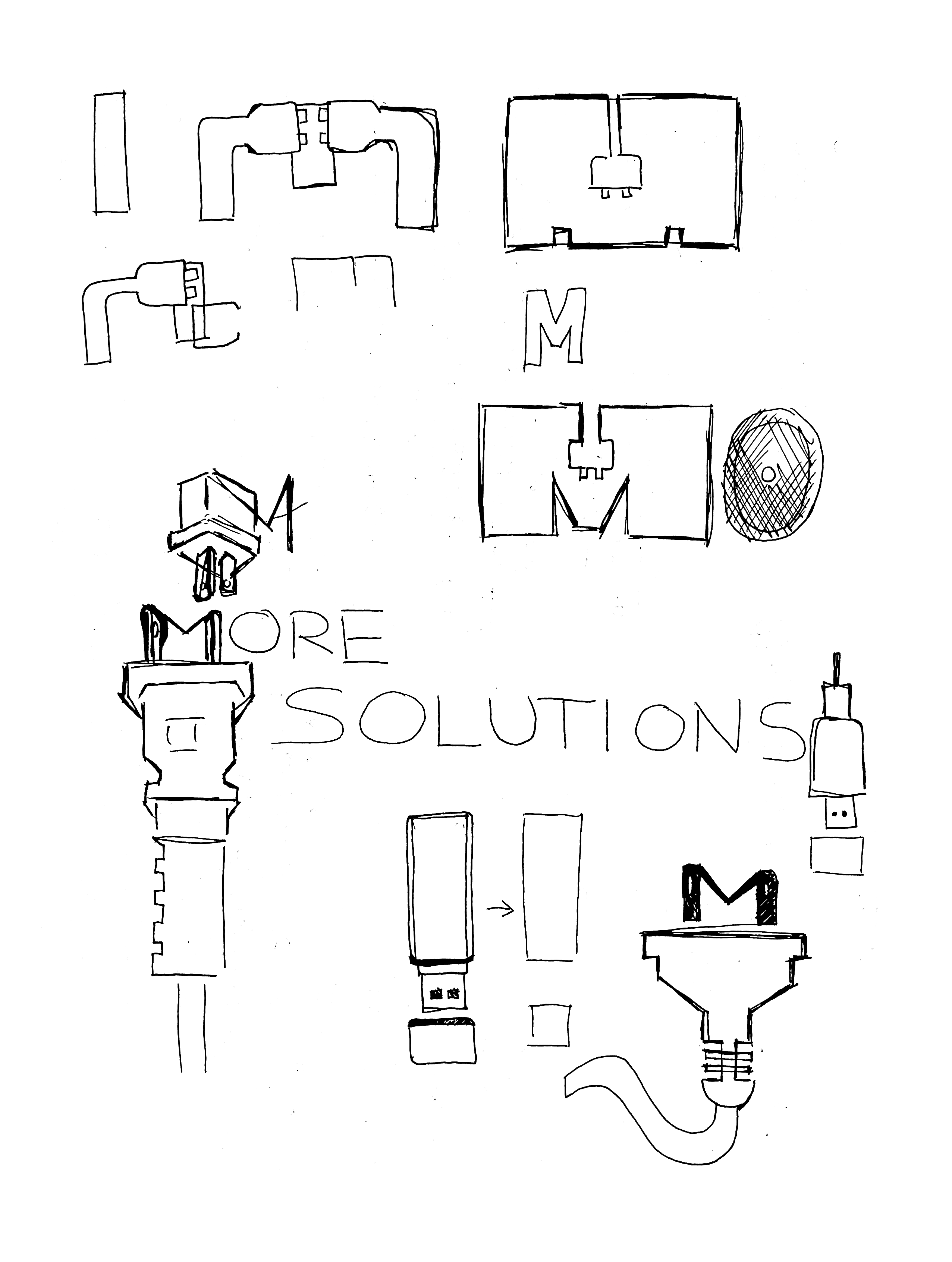
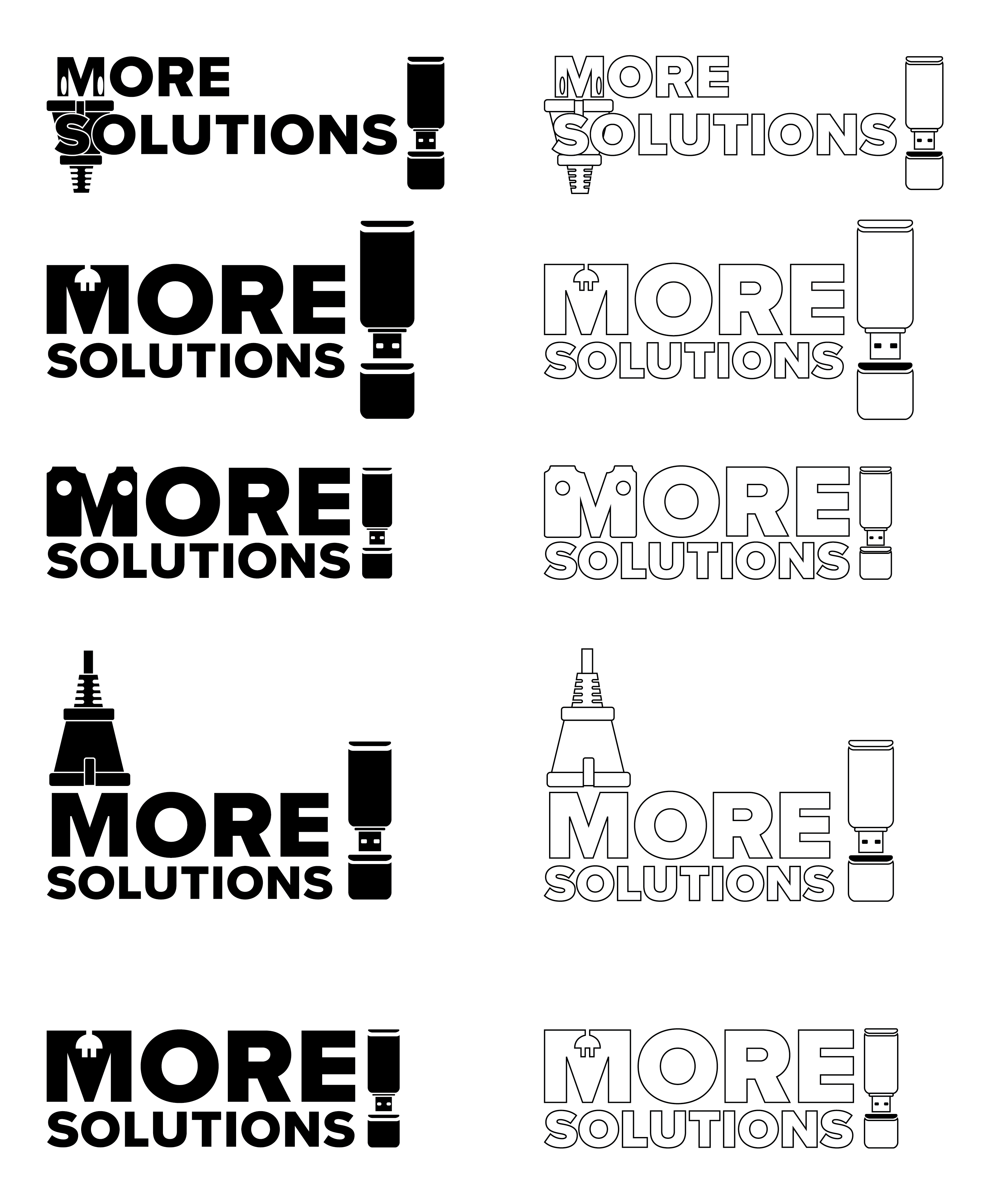
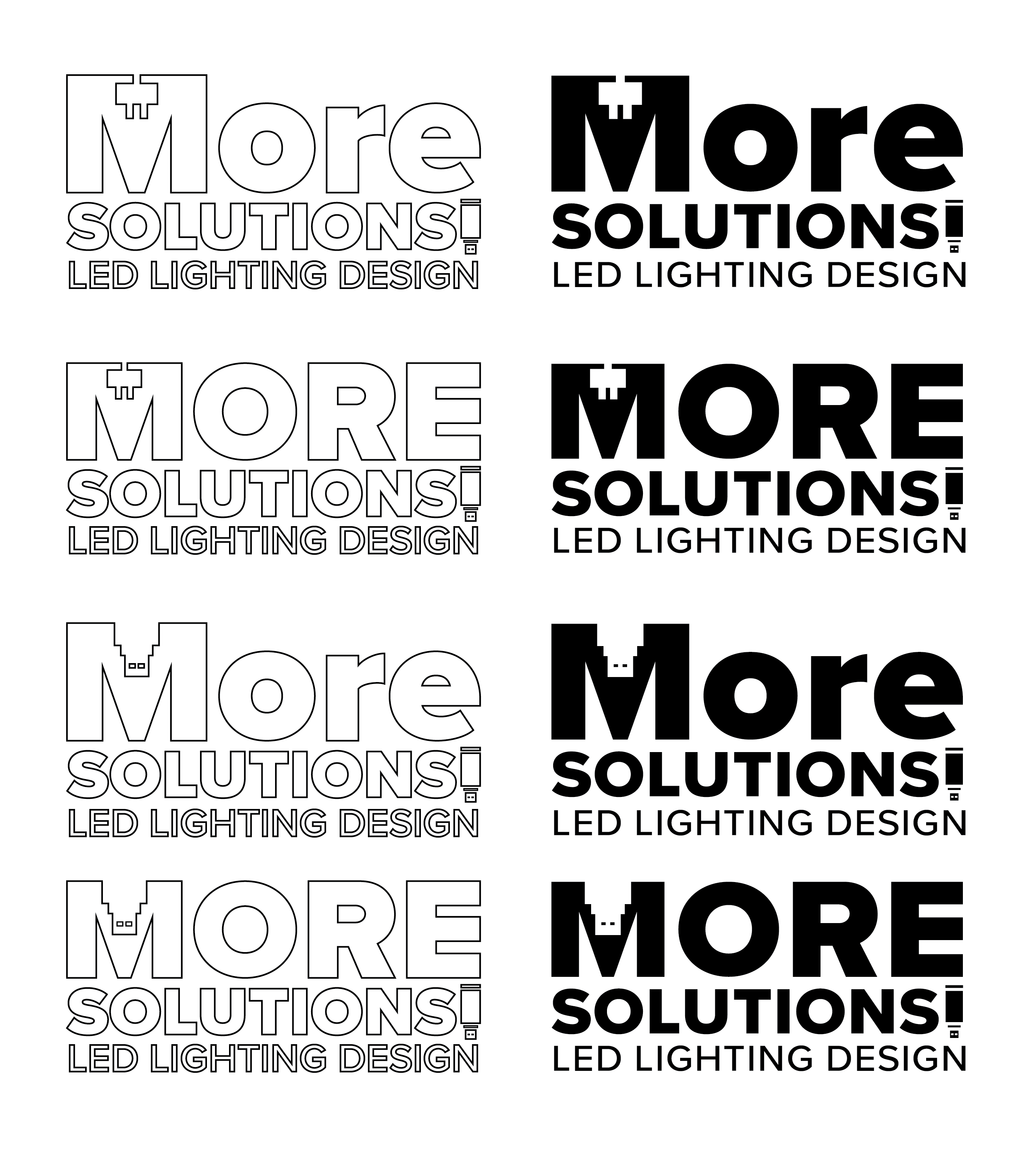
Working closely with the client, I explored several visual directions incorporating plug and USB motifs. The final mark features bold, modular letterforms and custom iconography—balancing a tech-forward aesthetic with clarity and adaptability.
Outcome
The final suite includes a wordmark, a dynamic submark, and a full lockup incorporating the tagline LED Lighting Design. The logo was provided in multiple formats and colorways for use on invoices, digital platforms, and future collateral.